Modische Maschen aus Marzahn-Hellersdorf
Wednesday, June 10th, 2015 Announcement on the door of Marie e.V.
randformblog on math, physics, art, and design |
Announcement on the door of Marie e.V.
 butchery goods
I had recently mentioned some practices in killing animals for meat production via socalled CO2 anesthesia. In this context it should be mentioned that there seem to exist also certain killing practices where the animal is not killed for consumption or disease prevention but in order to ensure something which some might interpret as “meat quality”.
There was recently an article in the german magazine Spiegel Online about a company here in Brandenburg which was in charge for duck mast. Activists had secretly filmed their practices. The breast of the specially fed ducks became so heavy that they partially couldn’t get back on their feet by themselves (warning: video behind the link). Moreover ducks which were not able to run fast and long enough (or which couldn’t get back on their feet by themselves) were slain with a pitchfork (warning: video behind the link). As the article says these marathon-slew practices seem to be illegal in Germany, but of course as one can see they seem to be not so easy to control, moreover there are countries where those practices seem to be legal.
As a matter of fact there seem to exist also cultural differences in mast practices. Like when I was working in Japan I met a woman from Bangladesh (a country which, as the reader probably knows, struggles with malnutrition and population growth), which did her Ph.D. on how to adjust nutrition for chickens in order to boost the size of chicken thighs, as apparently especially the thighs are very popular in Bangladesh. I didn’t ask her though about the use of tannery-scrap poultry feed because I didn’t know about this practice back then.

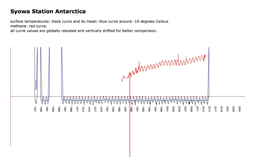
The investigation of methane and temperature values is still going on. Here a discussion on Azimuth about Antarctica (which to quite some extend concerned with where and how to get measurement values) and here a screenshot of a recent javascript document by Tim and me, sort of envisaged to be posted soon, eventually also with other measurements. The document shows the temperature and methane values of the japanese station Showa (Syowa) (webcam).
The attentive randform reader knows (see posts here and here) that Tim and me did an interactive visualization in which temperature stations and their data from a socalled “CRUTEM 4 surface temperature data collection” where displayed on a globe. In the posts it was already found that the data collection “deteriorated” in the last years, i.e. that there were fewer and fewer temperature data, especially in certain regions, available. There is now a post on the blog Azimuth by me in which I give also an overview about other data sets and visualizations, in particular I refer also to all data sets which were used by the Intergovernmental panel on Climate Change (IPCC) for their 4th assessment report, i.e. the report which was a major policy informer in the past recent years. In the blog post I just state what I have found and you can make up your mind about the state of data yourself. I state my opinion though in the comments to that blog post.
In case you weren’t reading the last post, because you were not interested in what duchess Kate Middleton was wrapping – the post was actually not about what she was wrapping. We just wanted to address another audience. The post was again about the question wether there may or may not be somewhat soon too less oxygen for breathing. In particular some quite “discomforting” facts with respect to this are mentioned in this last post.
You have probably seen this video where the duchess Kate Middleton rolls her eyes after being told “keep wrapping” during a charity visit within the US. Since it is the holiday season randform now proudly presents the exclusive footage on WHAT the duchess was actually told to wrap.


We here at randform are superexcited to present our first reader randform mega contest – simply called LeContest !!
Unfortunately our temperature visualization from last post is currently not running anymore. Probable reason: It currently seems that WebGl Earth has moved two library files. In particular the WebGl earth API base script which we were thinking was self-contained unfortunately doesn’t seem to be self-contained. We are going to look at this trouble in the near future.
supplement 05.10.2014: The interactive visualization is currently working again. Klokan technologies had responded and promised to look into this problem.

As was announced in the last post Tim and me were working at a visualization of the data collection CRUTEM 4 by the climate research unit (CRU) at the University of East Anglia. In the post it was mentioned that the data in that collection was sort of “deteriorating”. That is on one hand the number of active temperature measurement stations which were listed in this file (some stations started measuring already in the 18th century) decreased rather rapidly in the last ten years and/or the file contained increasingly invalid/no temperature data in the last ten years.
In that context it is worthwhile to note that CRUTEM 4 supercedes CRUTEM 3 and the CRUTEM 3 (grid data) was according to the Intergovernmental panel on Climate Change (IPCC) used for the IPCC fourth assessment report (AR 4).
Wether the “deterioration of that CRUTEM 4 data” has any effect on the assessment of the current global warming trends is another question. The application is now online. Explore yourself! Caution the data takes very long to load. The CRUTEM 4 data file is about 45 MB.
The following two interactive applications also display global temperature data:
– HADCRUT 3 (which uses CRUTEM 3) data is visualized here by Cliff Best.
– NOAAs Global Historical Climatology Network-Monthly (GHCN-M) is visualized here by Nick Stoves.
– our comparision of temperature anomalies, CO2 and methane values uses HADCRUT 4 which uses CRUTEM 4 and HadSST3 (sea surface temperatures).
warning: 18.10.2014
Unfortunately the application is currently not running anymore. Probable reason: It currently seems that WebGl Earth has moved two library files. In particular the WebGl earth API base script which we were thinking was self-contained unfortunately doesn’t seem to be self-contained. We are going to look at this trouble in the near future.
supplement 05.10.2014: The interactive visualization is currently working again. Klokan technologies had responded and promised to look into this problem.
Tim and me are currently working on a interactive browser visualization using temperature data from HADCRUT, namely the CRUTEM 4 temperature station data which we map with the help of the open source web GL earth API (which seems to be to quite some extend the work of the Czech-Swiss company Klokan technologies) onto a model of the earth (covered with open street maps).
The visualization is still work in progress, but what is already visible is that the temperature data is quite deteriorating (please see also the previous randform post on the topic of deteriorization of data). Where it looks as if the deterioration had been bigger in the years from 2000-2009 than in the years 1980-2000. Below you can see screenshots of various regions of the world for the month of January for the years 1980, 2000 and 2009. The color of a rectangle indicates the (monthly) temperature value for the respective station (the station is represented by a rectangle around its coordinates) which is encoded with the usual hue encoding (blue is cold, red is hot). Black rectangles are invalid data. The CRUTEM 4 data file contains the data of 4634 stations. Mapping all the station data makes the visualization very slow, especially for scaling, therefore the slightly different scalings/views for each region and the fact that screenshots are on display. The interactive application will probably be not for all stations at once.
North America:

Jan 1980

Jan 2000

Jan 2009
Africa:

Jan 1980

Jan 2000

Jan 2009
Asia:

Jan 1980

Jan 2000

Jan 2009
Eurasia/Northern Africa:

Jan 1980

Jan 2000

Jan 2009
Northpole:

Jan 1980

Jan 2000

Jan 2009
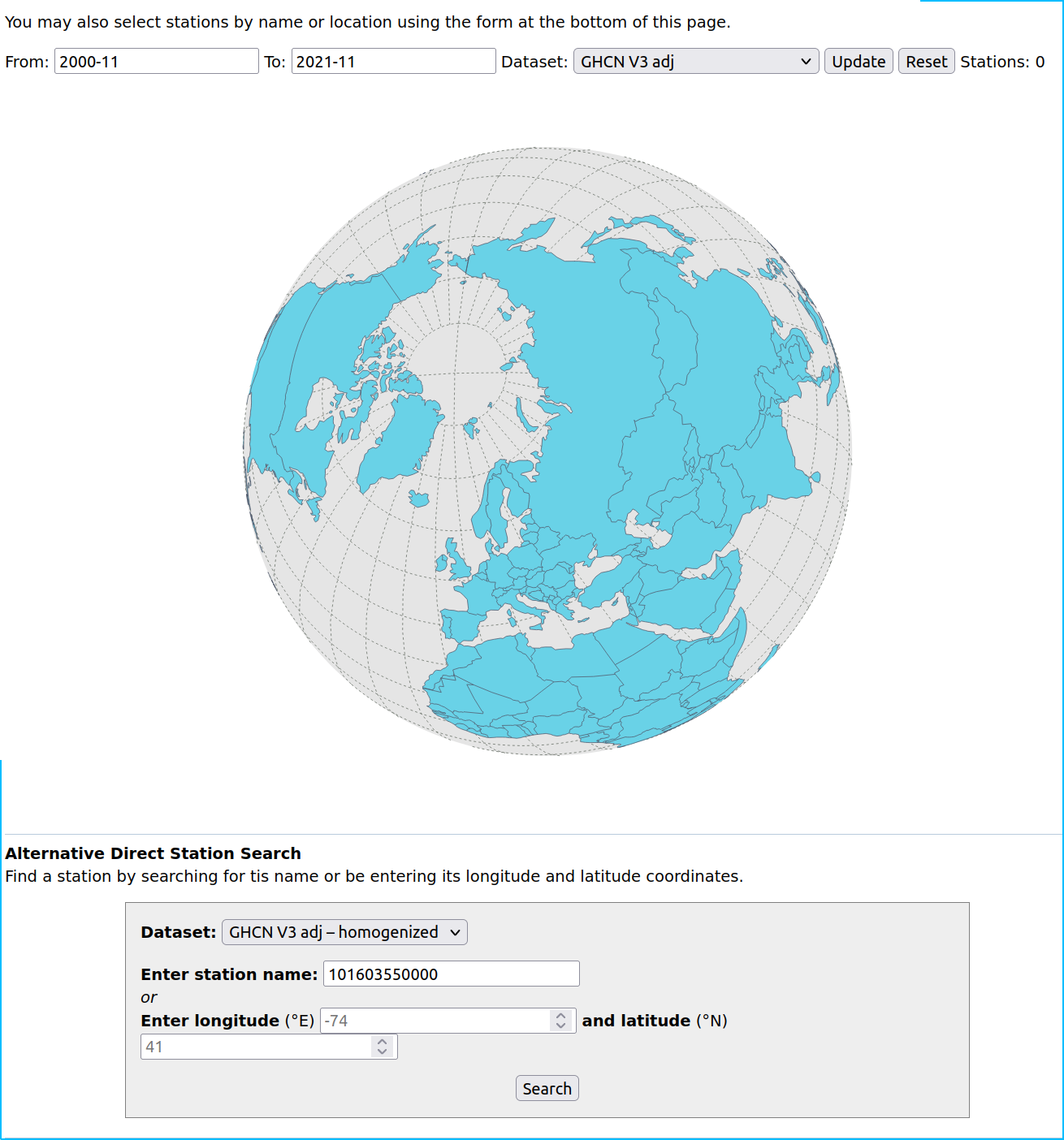
update June 15, 2019:
There is now a similar interactive visualization at NASA for the GHCN data set at https://data.giss.nasa.gov/gistemp/stdata/
update December 29, 2021:
The link to our interactive temperature visualization, which was announced above in the post is here, the corresponding post about it is here.
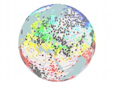
The GHCN page linked on June 15, 2019 doesn’t show any station data anymore:
There is currently a new page with a “version 4 dataset” here. This is how it currently looks like:
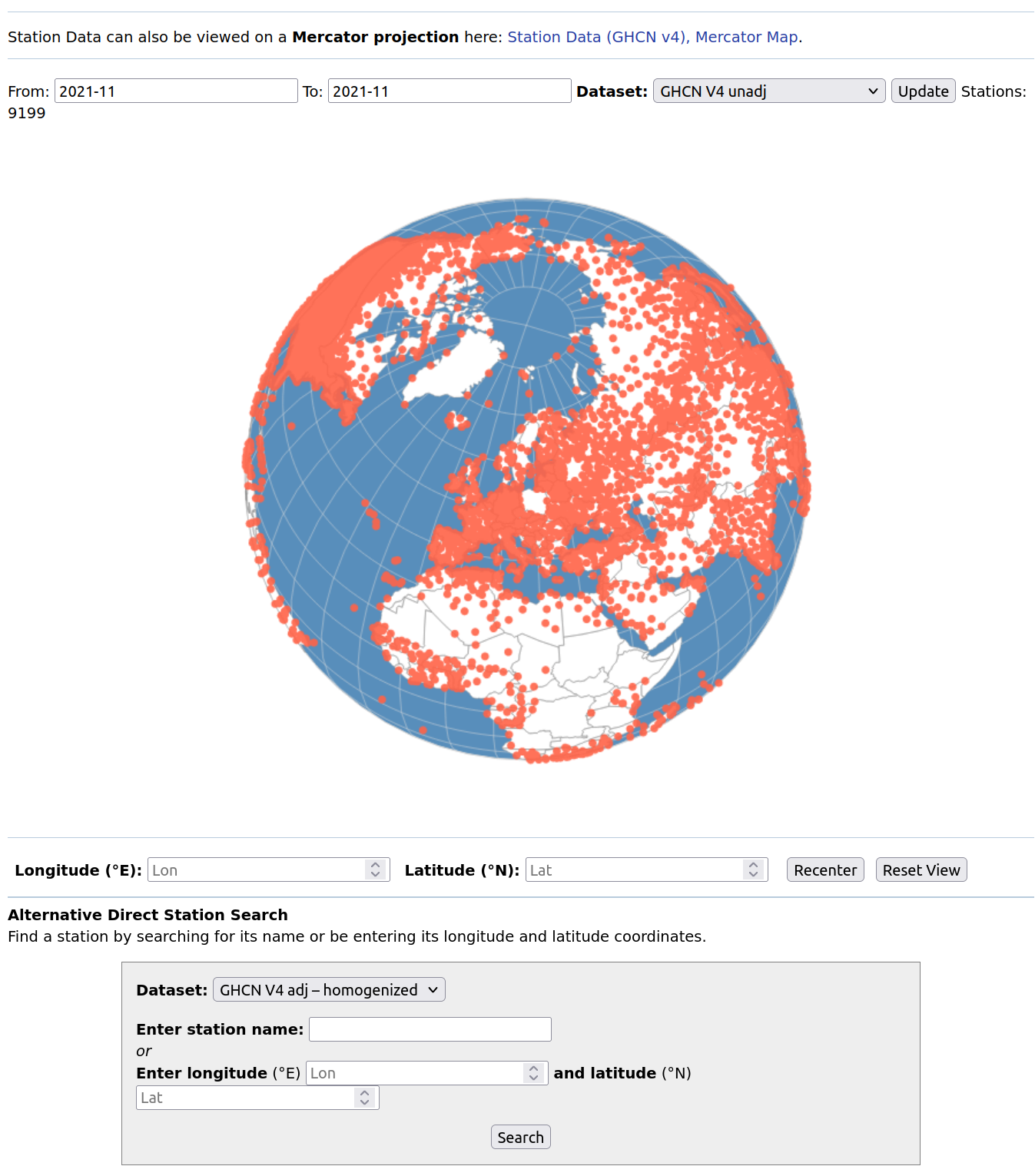
Apriori this looks as if most of the stations are “back on track” but then I couldn’t find out within a decent time how much of this data is “reconstructed” in the sense of “educated guess” and how much is actual data from the respective stations. Another thing that caught my attention was that the content of the tooltipmenu of each station is partially non accessible, I don’t remember whether this is a new phenomenon.