Archive for the 'perception' Category

Alert, Nunavut etc.

Saturday, November 28th, 2015

With some help from Tim and on the occasion of the 2015 United Nations Climate Change Conference I did a visualization which combines local temperatures with methane data. The local temperatures are from the HADCRUT4 file, so they unfortunately stop in 2011. The methane data is from the website of the Earth System Research Lab. Unfortunately there are not so many methane measurements as there should be. In particular very few temperature stations have also made methane measurements, so I improvised a bit and joined some measurement points which are geographically close. The measurements are from Vestmannaeyar, Iceland; Alert Nunavut, Canada; Svalbard, Norway with temperatures from Lufthavn and CH4 from Ny Ålesund; Syowa, Antarctica and from Azores, Portugal, where the temperatures are from Santa Maria Island and the methane data is from Terceira Island (if I interpreted the station names correctly).

I have currently not so much Internet time left, partly because I currently have a job, where I have to sit a lot in front of a computer and partly because I have been trying to improve things in my local surroundings (partially as it seems in vain though) – so no long explanations. I hope you see at least what I see in the images above.

temperature curve: mean of anomalies (monthly deviations of values from monthly mean over measured time period, annual mean of that)
methane curve: annual mean of values

refugees and integration

Monday, August 3rd, 2015


veggies at a food discounter in Berlin

veggies in a market in Tangier, Morocco (according to Eurostat 4,255 asylum applicants came to Europe from Morocco in 2014).

(more…)

global warming didn’t stop

Saturday, July 11th, 2015

Image from NOAA (public domain if I understood correctly)

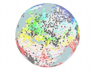
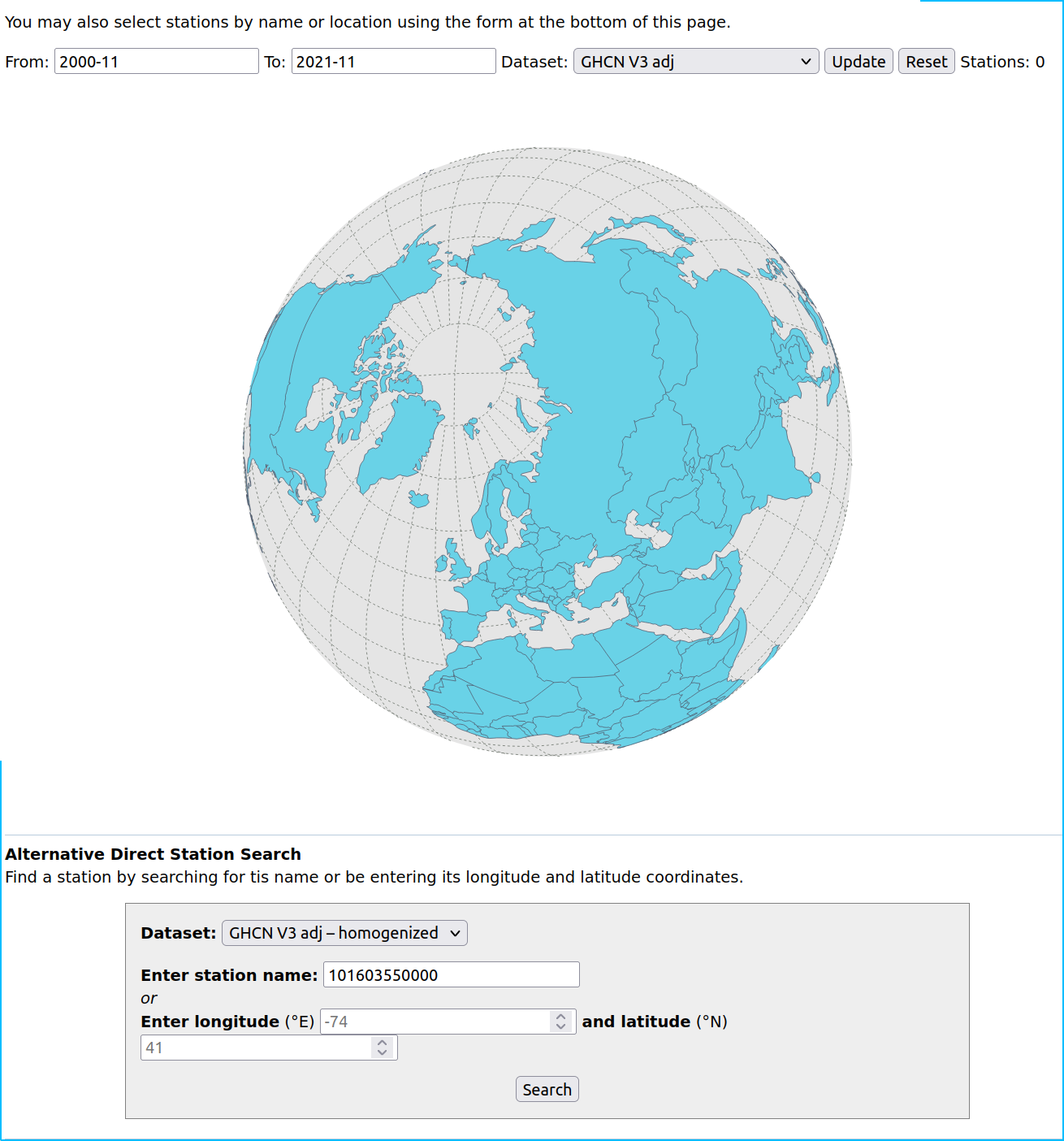
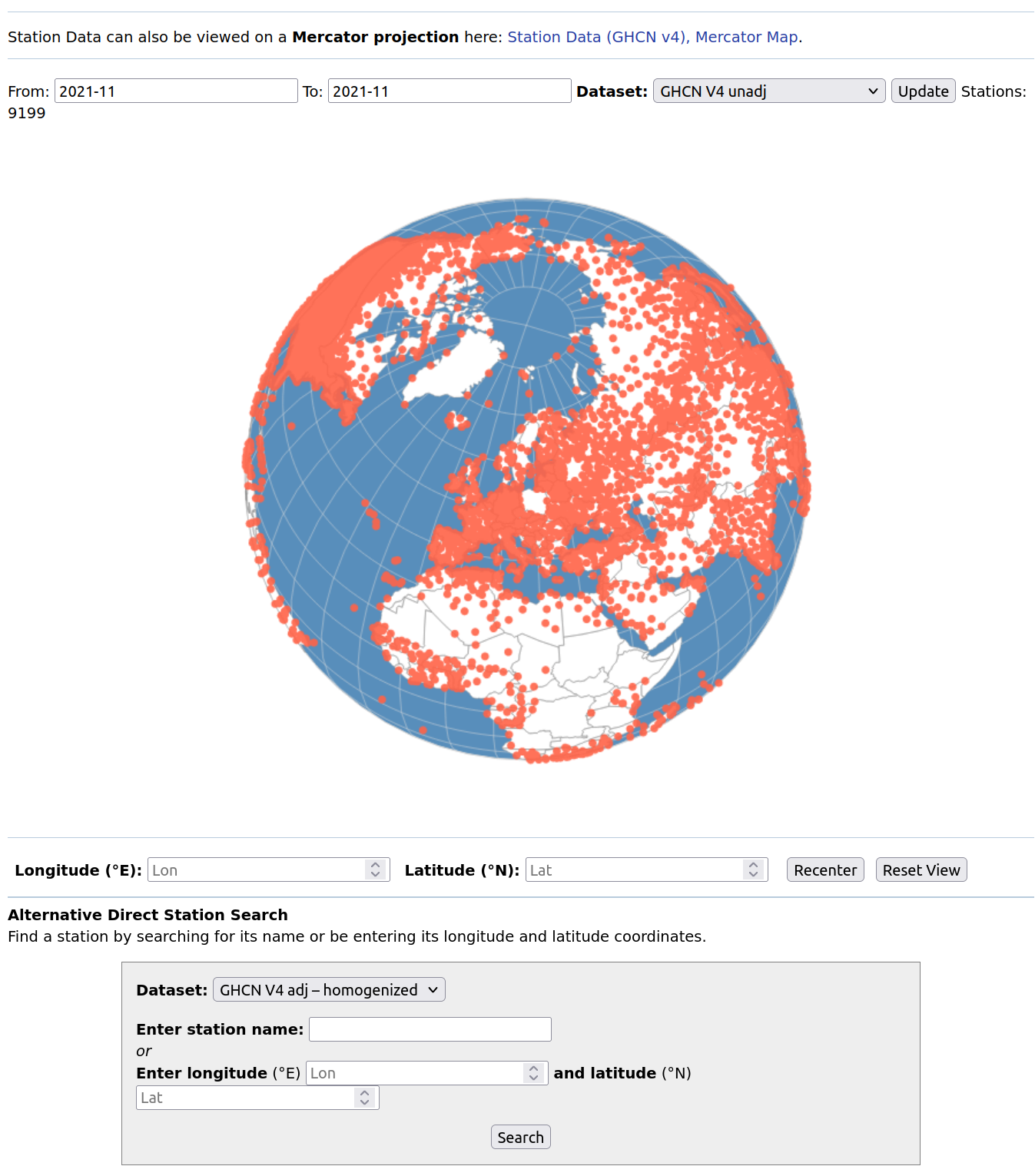
Those who follow the randform posts closely know that Tim and me had worked on a visualization of a main collection of global temperature stations. It was used in a post on Azimuth – a blog which is mostly concerned with environmental topics and which is run by the mathematical physicist John Baez. In the post I reviewed the temperature data, which was used by the IPCC for their sofar published climate Assessment Reports up to AR4 in 2007. I left the conclusions about the investigated temperature records and their quality to the reader, but in the comment section I became a bit more “direct” and wrote:

Well every reader may judge him/herself by looking at the visualizations. If you want my opinion: I think this is rather catastrophic. In particular I wouldn’t wonder if the “global warming hiatus” is connected to the gaps.

The “global warming hiatus” or “global warming pause” is a finding that the global temperature rise has approximately paused since 1998 and hence by making this comment I questioned this “warming pause” or at least its shape. Unfortunately my suspicion has now been more or less confirmed. That is there global warming continues.

The article “Possible artifacts of data biases in the recent global surface warming hiatus” by Karl et al. Science 2015 0 (2015)” in the journal “Science” has unfortunately to be rented for the prize of 20$/day for reading (so I haven’t looked at it), but NOAA has a summary, where it is written:

“Adding in the last two years of global surface temperature data and other improvements in the quality of the observed record provide evidence that contradict the notion of a hiatus in recent global warming trends,” said Thomas R. Karl, L.H.D., Director, NOAA’s National Centers for Environmental Information. “Our new analysis suggests that the apparent hiatus may have been largely the result of limitations in past datasets, and that the rate of warming over the first 15 years of this century has, in fact, been as fast or faster than that seen over the last half of the 20th century.”

About the newly included datasets it is written:

New analyses with these data demonstrate that incomplete spatial coverage also led to underestimates of the true global temperature change previously reported in the 2013 IPCC report. The integration of dozens of data sets has improved spatial coverage over many areas, including the Arctic, where temperatures have been rapidly increasing in recent decades. For example, the release of the International Surface Temperature Initiative databank, integrated with NOAA’s Global Historical Climatology Network-Daily dataset and forty additional historical data sources, has more than doubled the number of weather stations available for analysis.

I mentioned the International Surface Temperature Initiative (ISTI) in the Azimuth blogpost together with a citation from their blog:

The ISTI dataset is not quality controlled, so, after re-reading section 3.3 of Lawrimore et al 2011, I implemented an extremely simple quality control scheme, MADQC.

which doesn’t sound too great, if it comes to quality assessment.

But still: I suspect that the new temperature curves of that article match the real temperatures to a much better degree than the ones which were used for the IPCC reports until 2013.
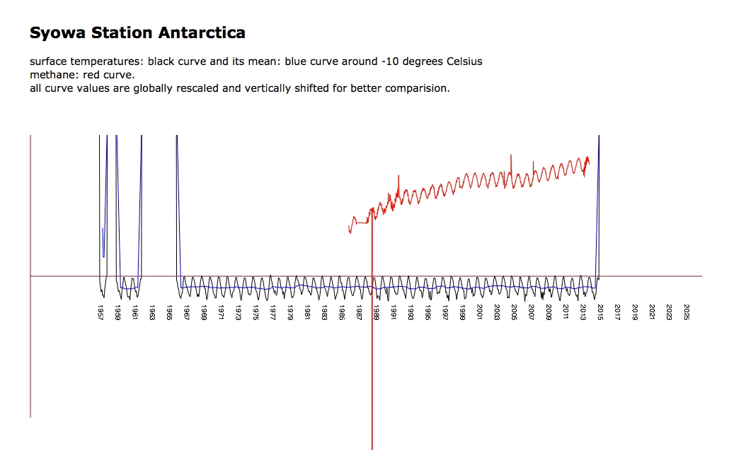
It is though unfortunate that these new temperatures are not available, because I still have that suspicion that the role of methane in that warming trend is greatly underestimated and I still think it IS ULTIMATELY URGENT to investigate that suspicion. The exact shape of the curve would be rather important, because amongst others there was also a “hiatus” in the rise of methane and I think you can see that short pause in the above image.

Methane may however play eventually also a role in a way more dramatic environmental context. In my point of view that context should also be investigated URGENTLY, but it seems the view of methane is viewed controversely among climate scientists, at least Gavin Schmidt of the NASA’s Goddard Institute for Space Studies blurrily expressed anti-alarmistic words in an interview with John H. Richardson from Esquire (Esquire link via John Baez) by saying that:

“The methane thing is actually something I work on a lot, and most of the headlines are crap. There’s no actual evidence that anything dramatically different is going on in the Arctic, other than the fact that it’s melting pretty much everywhere.”

Showa Values

Wednesday, March 25th, 2015


The investigation of methane and temperature values is still going on. Here a discussion on Azimuth about Antarctica (which to quite some extend concerned with where and how to get measurement values) and here a screenshot of a recent javascript document by Tim and me, sort of envisaged to be posted soon, eventually also with other measurements. The document shows the temperature and methane values of the japanese station Showa (Syowa) (webcam).

Exploring Climate Data (Part 3)

Friday, February 13th, 2015

The attentive randform reader knows (see posts here and here) that Tim and me did an interactive visualization in which temperature stations and their data from a socalled “CRUTEM 4 surface temperature data collection” where displayed on a globe. In the posts it was already found that the data collection “deteriorated” in the last years, i.e. that there were fewer and fewer temperature data, especially in certain regions, available. There is now a post on the blog Azimuth by me in which I give also an overview about other data sets and visualizations, in particular I refer also to all data sets which were used by the Intergovernmental panel on Climate Change (IPCC) for their 4th assessment report, i.e. the report which was a major policy informer in the past recent years. In the blog post I just state what I have found and you can make up your mind about the state of data yourself. I state my opinion though in the comments to that blog post.

New facts about O2

Friday, January 16th, 2015

In case you weren’t reading the last post, because you were not interested in what duchess Kate Middleton was wrapping – the post was actually not about what she was wrapping. We just wanted to address another audience. The post was again about the question wether there may or may not be somewhat soon too less oxygen for breathing. In particular some quite “discomforting” facts with respect to this are mentioned in this last post.

keep gift wrapping (Update)

Tuesday, December 23rd, 2014

You have probably seen this video where the duchess Kate Middleton rolls her eyes after being told “keep wrapping” during a charity visit within the US. Since it is the holiday season randform now proudly presents the exclusive footage on WHAT the duchess was actually told to wrap.

(more…)

visibility deterioration of deterioration

Thursday, September 18th, 2014

Unfortunately our temperature visualization from last post is currently not running anymore. Probable reason: It currently seems that WebGl Earth has moved two library files. In particular the WebGl earth API base script which we were thinking was self-contained unfortunately doesn’t seem to be self-contained. We are going to look at this trouble in the near future.

supplement 05.10.2014: The interactive visualization is currently working again. Klokan technologies had responded and promised to look into this problem.

detoration explordaration

Tuesday, September 2nd, 2014

As was announced in the last post Tim and me were working at a visualization of the data collection CRUTEM 4 by the climate research unit (CRU) at the University of East Anglia. In the post it was mentioned that the data in that collection was sort of “deteriorating”. That is on one hand the number of active temperature measurement stations which were listed in this file (some stations started measuring already in the 18th century) decreased rather rapidly in the last ten years and/or the file contained increasingly invalid/no temperature data in the last ten years.

In that context it is worthwhile to note that CRUTEM 4 supercedes CRUTEM 3 and the CRUTEM 3 (grid data) was according to the Intergovernmental panel on Climate Change (IPCC) used for the IPCC fourth assessment report (AR 4).

Wether the “deterioration of that CRUTEM 4 data” has any effect on the assessment of the current global warming trends is another question. The application is now online. Explore yourself! Caution the data takes very long to load. The CRUTEM 4 data file is about 45 MB.

The following two interactive applications also display global temperature data:

– HADCRUT 3 (which uses CRUTEM 3) data is visualized here by Cliff Best.

NOAAs Global Historical Climatology Network-Monthly (GHCN-M) is visualized here by Nick Stoves.

– our comparision of temperature anomalies, CO2 and methane values uses HADCRUT 4 which uses CRUTEM 4 and HadSST3 (sea surface temperatures).

warning: 18.10.2014
Unfortunately the application is currently not running anymore. Probable reason: It currently seems that WebGl Earth has moved two library files. In particular the WebGl earth API base script which we were thinking was self-contained unfortunately doesn’t seem to be self-contained. We are going to look at this trouble in the near future.

supplement 05.10.2014: The interactive visualization is currently working again. Klokan technologies had responded and promised to look into this problem.

On the deterioration of data

Thursday, August 21st, 2014

Tim and me are currently working on a interactive browser visualization using temperature data from HADCRUT, namely the CRUTEM 4 temperature station data which we map with the help of the open source web GL earth API (which seems to be to quite some extend the work of the Czech-Swiss company Klokan technologies) onto a model of the earth (covered with open street maps).
The visualization is still work in progress, but what is already visible is that the temperature data is quite deteriorating (please see also the previous randform post on the topic of deteriorization of data). Where it looks as if the deterioration had been bigger in the years from 2000-2009 than in the years 1980-2000. Below you can see screenshots of various regions of the world for the month of January for the years 1980, 2000 and 2009. The color of a rectangle indicates the (monthly) temperature value for the respective station (the station is represented by a rectangle around its coordinates) which is encoded with the usual hue encoding (blue is cold, red is hot). Black rectangles are invalid data. The CRUTEM 4 data file contains the data of 4634 stations. Mapping all the station data makes the visualization very slow, especially for scaling, therefore the slightly different scalings/views for each region and the fact that screenshots are on display. The interactive application will probably be not for all stations at once.

North America:


Jan 1980


Jan 2000


Jan 2009

Africa:


Jan 1980


Jan 2000


Jan 2009

Asia:


Jan 1980


Jan 2000


Jan 2009

Eurasia/Northern Africa:


Jan 1980


Jan 2000


Jan 2009

Northpole:


Jan 1980


Jan 2000


Jan 2009

update June 15, 2019:
There is now a similar interactive visualization at NASA for the GHCN data set at https://data.giss.nasa.gov/gistemp/stdata/

update December 29, 2021:
The link to our interactive temperature visualization, which was announced above in the post is here, the corresponding post about it is here.

The GHCN page linked on June 15, 2019 doesn’t show any station data anymore:

There is currently a new page with a “version 4 dataset” here. This is how it currently looks like:


Apriori this looks as if most of the stations are “back on track” but then I couldn’t find out within a decent time how much of this data is “reconstructed” in the sense of “educated guess” and how much is actual data from the respective stations. Another thing that caught my attention was that the content of the tooltipmenu of each station is partially non accessible, I don’t remember whether this is a new phenomenon.