selection criteria
This is a follow-up to my last post about food and environment
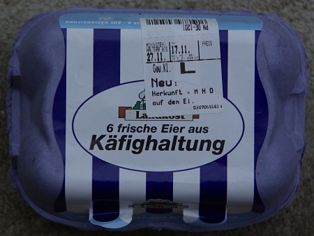
Despite the fact that probably most consumers know about the conditions at intensive egg farms (here e.g. a video about an intensive egg farm without a guarantee how correct the footage is) I was astonished to find the above package in a local supermarket.
The astonishing part of the above is the way graphic design managed to make the writing “käfighaltung” (caging) look as something pleasant. Part of it is that we are used to the fact that if someone advertizes something big than this must be good (at least from the point of view of the advertizer). In the addition the blue and white stripes (presumably the cage bars) look a bit as an awning – as if the cage is mainly a shield and not a cage. For me this is a remarkable example of how design may change the desirability of objects. It may serve also as an interesting comment on the objectivity of selection criteria.
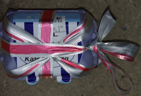
I can’t think of how the design of the above package could be improved, besides may be making it into a present: