the color of color
manicone is online now. The coloring of manicone took more time than expected. The coloring made it necessary to consider theories and examples of artistic color compositions, physical mixing properties, technological limitations (calibrations) and infoesthetic basics (For a glimpse onto the problem of coloring and infoesthetics see e.g. this video lecture by tamara munzner (who was a visiting scientist of the TU math department in the mid nineties) or the review on pingmag.
It is a difficult question to find the right portion between colorful and colorful. Colors may be shouting. If they unfriendly shout you down then this is not acceptable. If the are too faint and disappear among the other colors then this is not acceptable either. Due to the transparency properties of manicone, color mixing was likewise an important question.
September 25th, 2009 at 4:57 pm
interesting color interplay. did you get your palette from an image?
September 25th, 2009 at 5:32 pm
yes indeed I took the palette from this image of a pink knick-khack store:
no but seriously transparency is making color choices more difficult, however without the transparency feature you have no chance to understand whats happening with manicone.
September 27th, 2009 at 12:44 pm
so whats so bad about the above image of the pink knick knack shop?
September 27th, 2009 at 2:28 pm
kitty wrote:
> so whats so bad about the above image of the pink knick knack shop?
a priori there is nothing “bad” about the image, the images color balance towards pink-rose may give an interesting palette for e.g. a wall paper.
However it is clear that if one would use the above image for manicone then one would obtain a blurry pink-rose-lilac cloud and in terms of spatial information there would be no big difference to the original black and white version – on the contrary – a pink-rose-lilac version would probably make everything spatially even more inaccessible since the clear forms – which you have in the black and white version – would appear blurred due to the color overload.
The reason why graphic designers like to pick their palette from photos lies in the fact that in a photo the “overtones” of light are – due to light reflection properties automatically rather harmonic. And in fact for the finetuning of some of the colors in manicone I used e.g. a landscape photo. However the overall choice and composition of colors is usually motivated mainly by other aspects, like e.g. purpose, medium (paper,screen, interactivity etc.) and audience.
For manicone e.g. there were certain obvious technical constraints. Like due to the processing limitations it is rather slow. A stereographic view with a depth cue would certainly provide more spatial information than what one currently sees in the manicone Java applet, or in other words the applet is rather “flat” and has a rather 2 dimensional-graphical look.
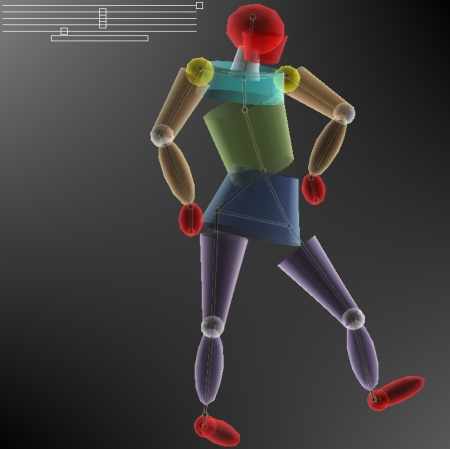
So given the 2 dimensional-look (which is not bad per se by the way) I e.g. decided among others to use color for “coding” parts of the spatial information, that is the “boundary” (head, paws, feet) are red, the upper body parts are greenish, the lower body parts are blueish. In addition I wanted to have most of the body parts to have different colors so that if one zips into the fourth dimension one should still be able to identify each part of manicone. The colors serve thus as a kind of “alphabeth.”
Alas, if you make such a descision then it is very easy to assemble a noisy shouting color mixture, because you have basically no limitations on your palette like in terms of an overall tone. One also had to keep in mind that the colors need to be different enough in order to be also different enough on differently calibrated screens.
As already said another problem is the transparency. If you have complete transparency then you have an automatic color mixing, that is whereas in a partial transparency usually the nontransparent objects dominate we have here a rather complex mix and it is not so easy to find the right balance.
So for making the above choice I looked at other experiments with transparent objects and color and let my intuition guide me. (that may look in some peoples eyes awkward though…:)) So for example the shouting red – due to its dominance and high salience properties actually makes the rest of colors look more harmonic together than they would look seperately a.s.o. I played around a lot, but finally always returned to that above mix, which gave me some indication that it was more suitable than the other choices.
Manicone however may in principle be viewed in stereoscopic view and it is quite probable that for that purpose another choice of colors could be more appropriate.